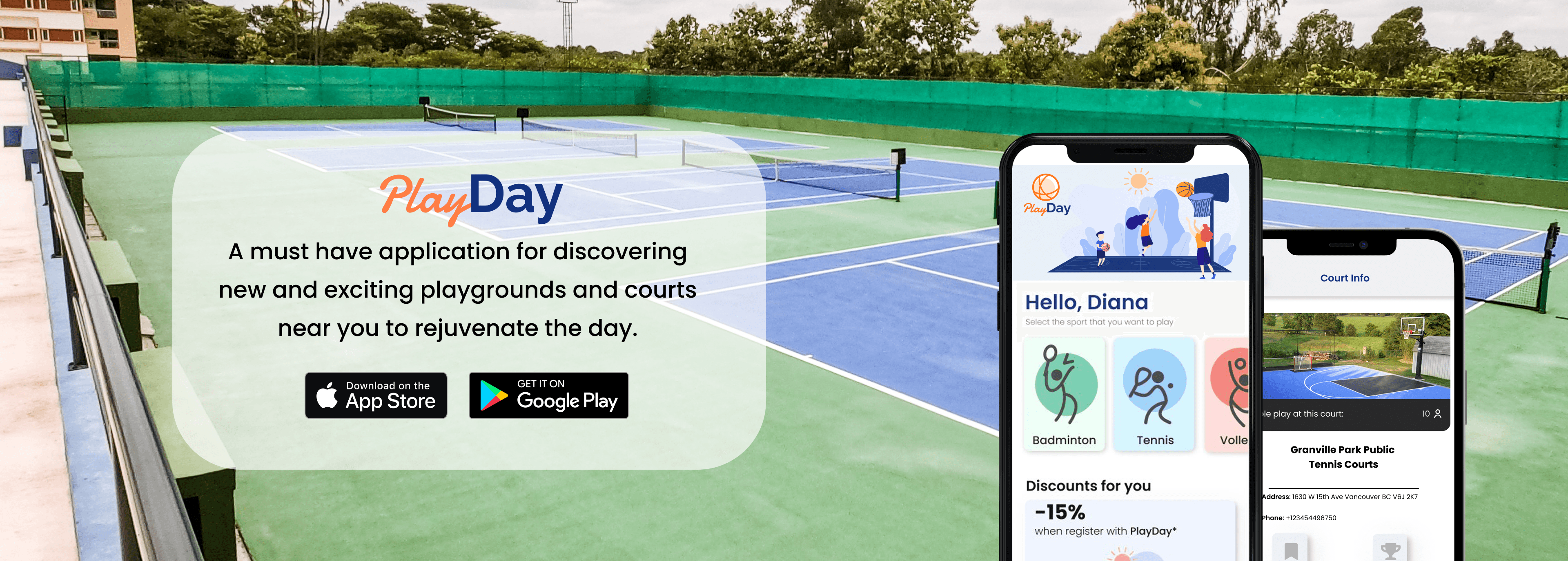

During this project, I collaborated with a team to design a mobile application for people to easily find courts in their area. The app allows users to arrange matches and track scores with just a single click.

INTRODUCTION
Project information
Duration:
My role:
Team size:
Platform:
12 weeks
Project Manager & UX Designer
3 Developers & 2 Designers
Problem - Finding Courts and Compatible Partners
Finding clubs, courts, and like-minded players for team sports poses a significant challenge, particularly in matching individuals with similar skill levels.
A solution for sports enthusiast
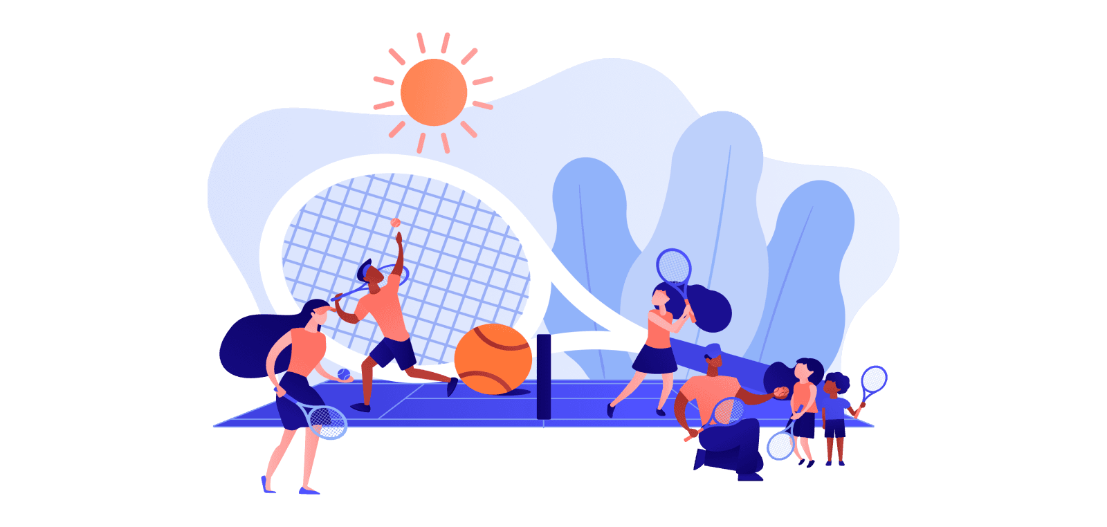
Introducing the app that will empower users to easily discover nearby courts and clubs catered to their favourite sports. Additionally, PlayDay will facilitate seamless connections between users and active players through its messaging functionality and geolocation.
DISCOVER
Secondary Research
We initiated our research by exploring local magazines and online articles. "Operations Sports highlights the importance of connecting team players based on their skill levels," emphasizing the necessity of allowing new players time to improve their abilities.

Primary Research - Open Ended Interviews
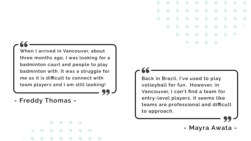
I conducted six open-ended interviews with the target audience to validate whether they faced challenges in finding courts or players to engage with. These interviews were recorded and analyzed by the team to capture any valuable insights, below you can see some testimonials.
Competitors Research
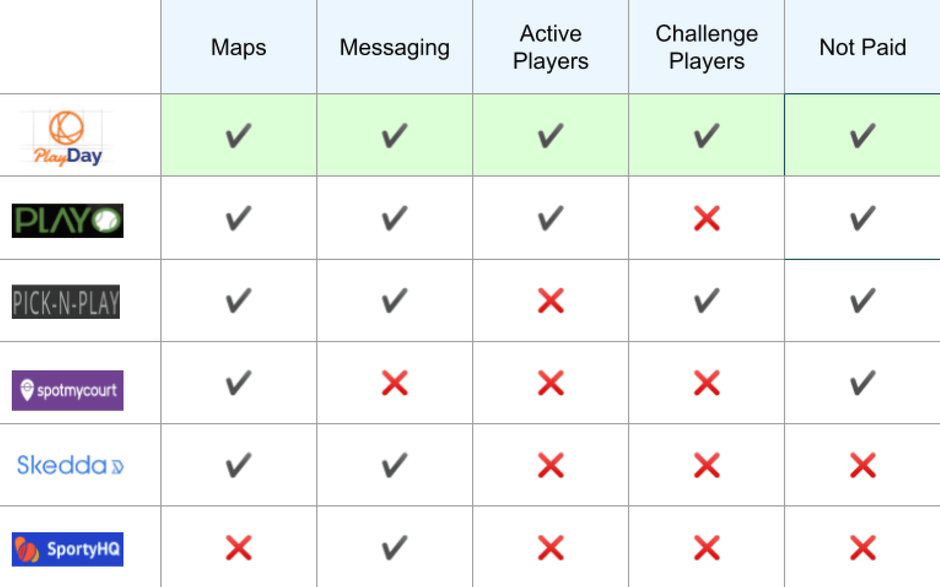
To validate our assumptions, we conducted a thorough analysis of existing applications in the market. This in-depth examination allowed us to identify the features offered by our competitors and identify areas where we could differentiate ourselves.
Project Charter
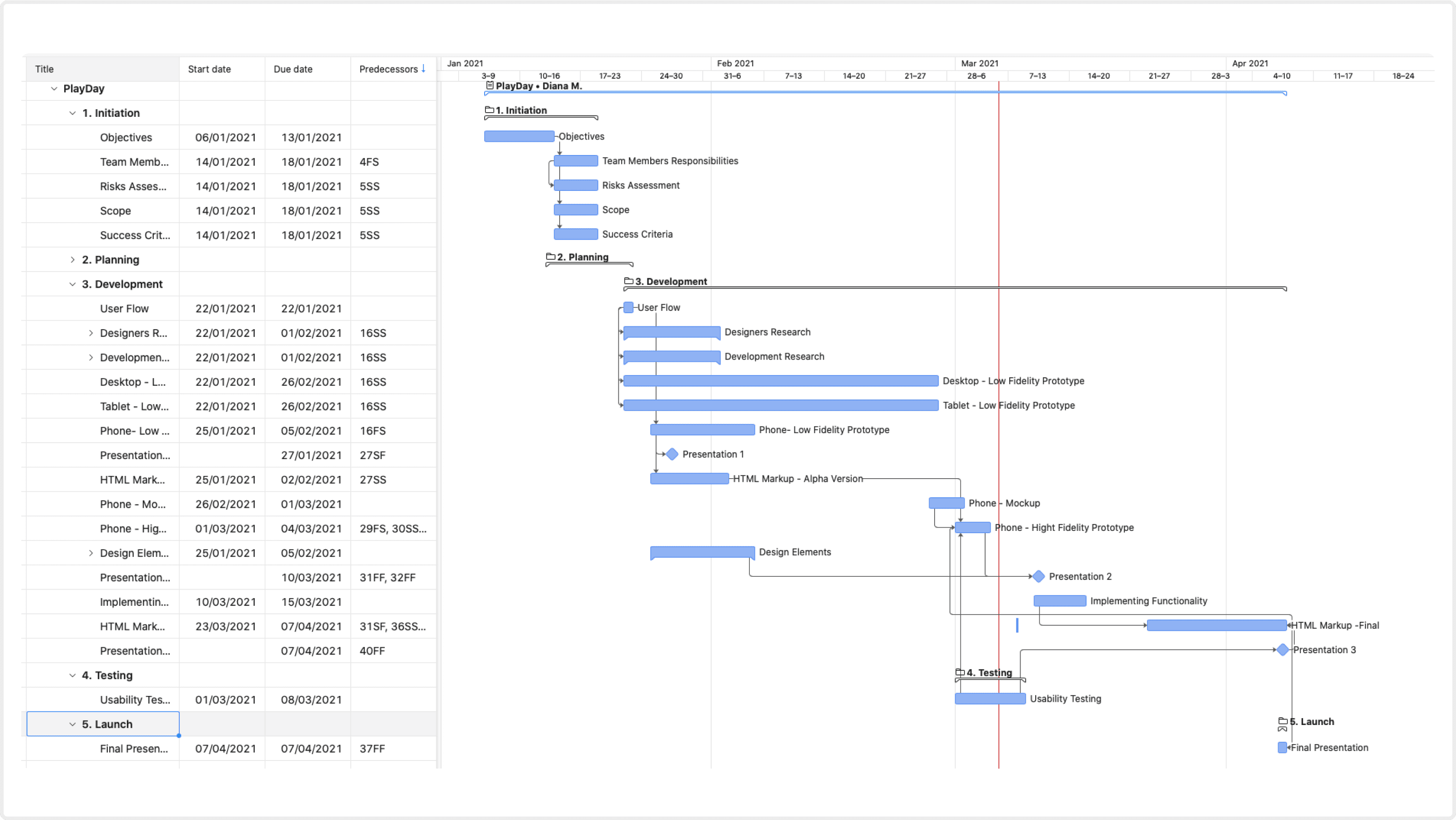
I've crafted the project charter to outline clear deadlines for developers and designers, ensuring everyone is aligned with their deliverables. Following a thorough review by the team, adjustments were made to accommodate sufficient time for each sprint.

Project Management
For this project, we experimented with a sophisticated tool called Wrike. However, given our team's size, we found it overly complex and detailed. Recognizing the need for simplicity, we transitioned to Asana.
Define
User Flow
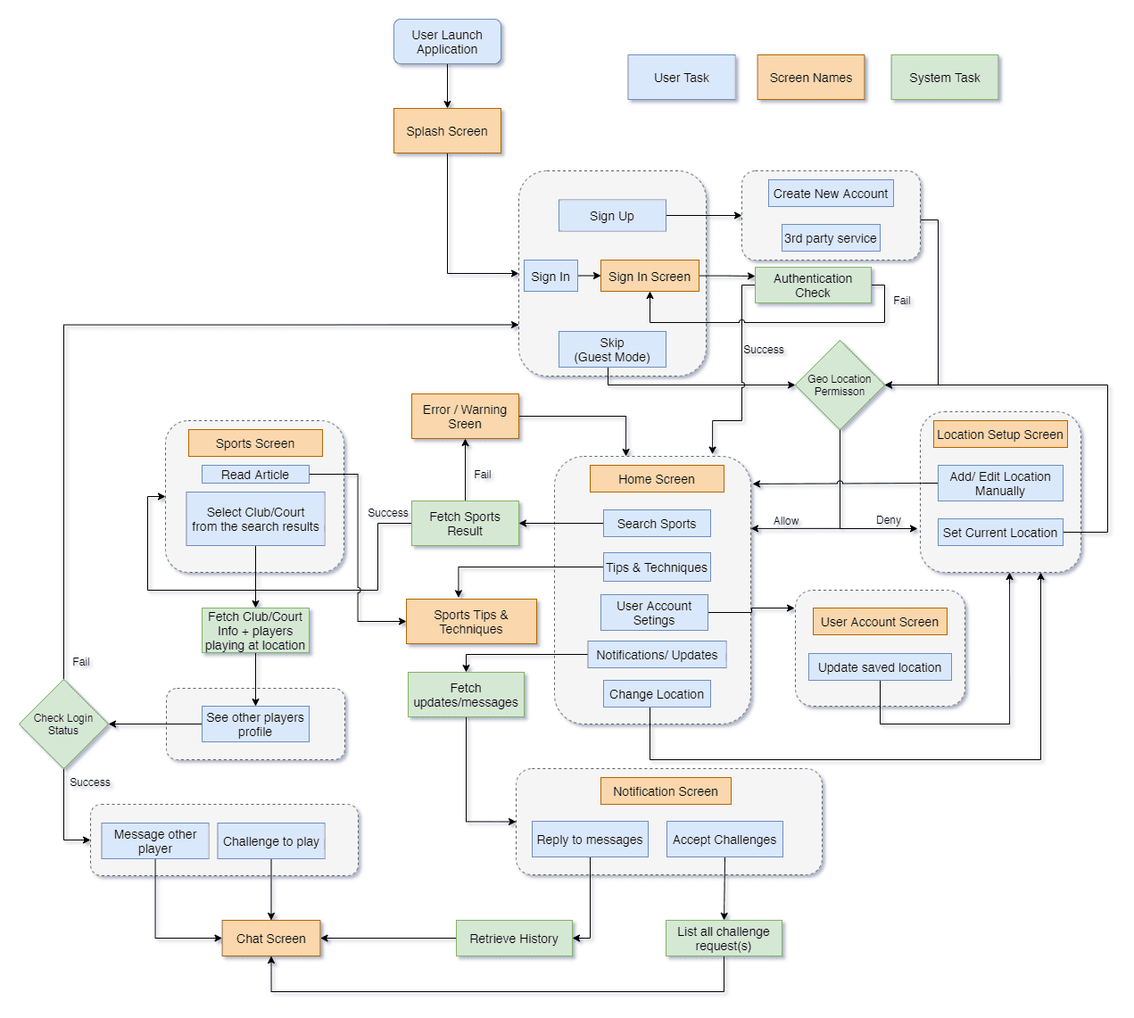
After analyzing our research findings, I transitioned into the defining the user flow. To ensure clarity and alignment among team members, we developed a user flow outlining the application's capabilities and how they would integrate with each other.
Features Definition
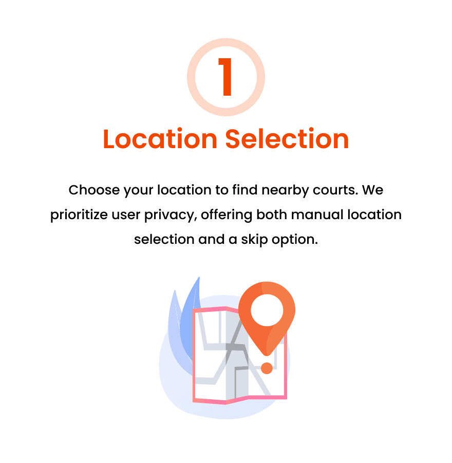
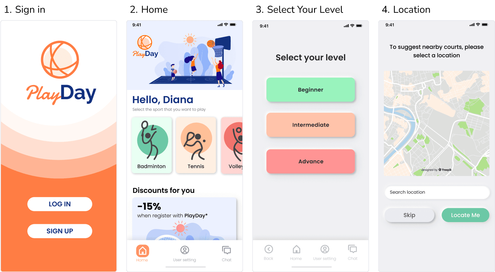
Location Selection: Choose your location to find nearby courts. We prioritize user privacy, offering both manual location selection and a skip option.
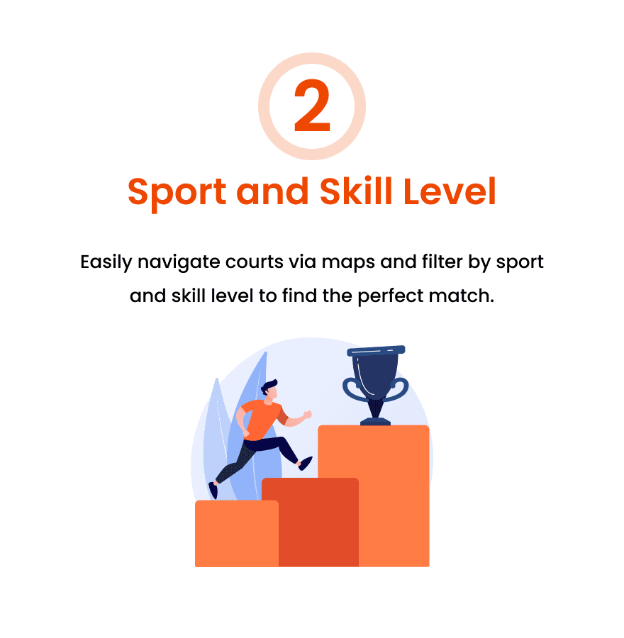
Sport and Skill Level: Easily navigate courts via maps and filter by sport and skill level to find the match.
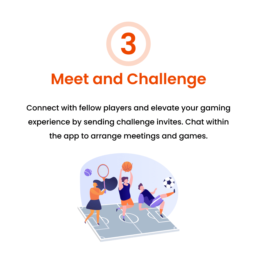
Meet and Challenge: Connect with fellow players and elevate your gaming experience by sending challenge invites. Chat within the app to arrange meetings and games.
IDEATE
Wireframes
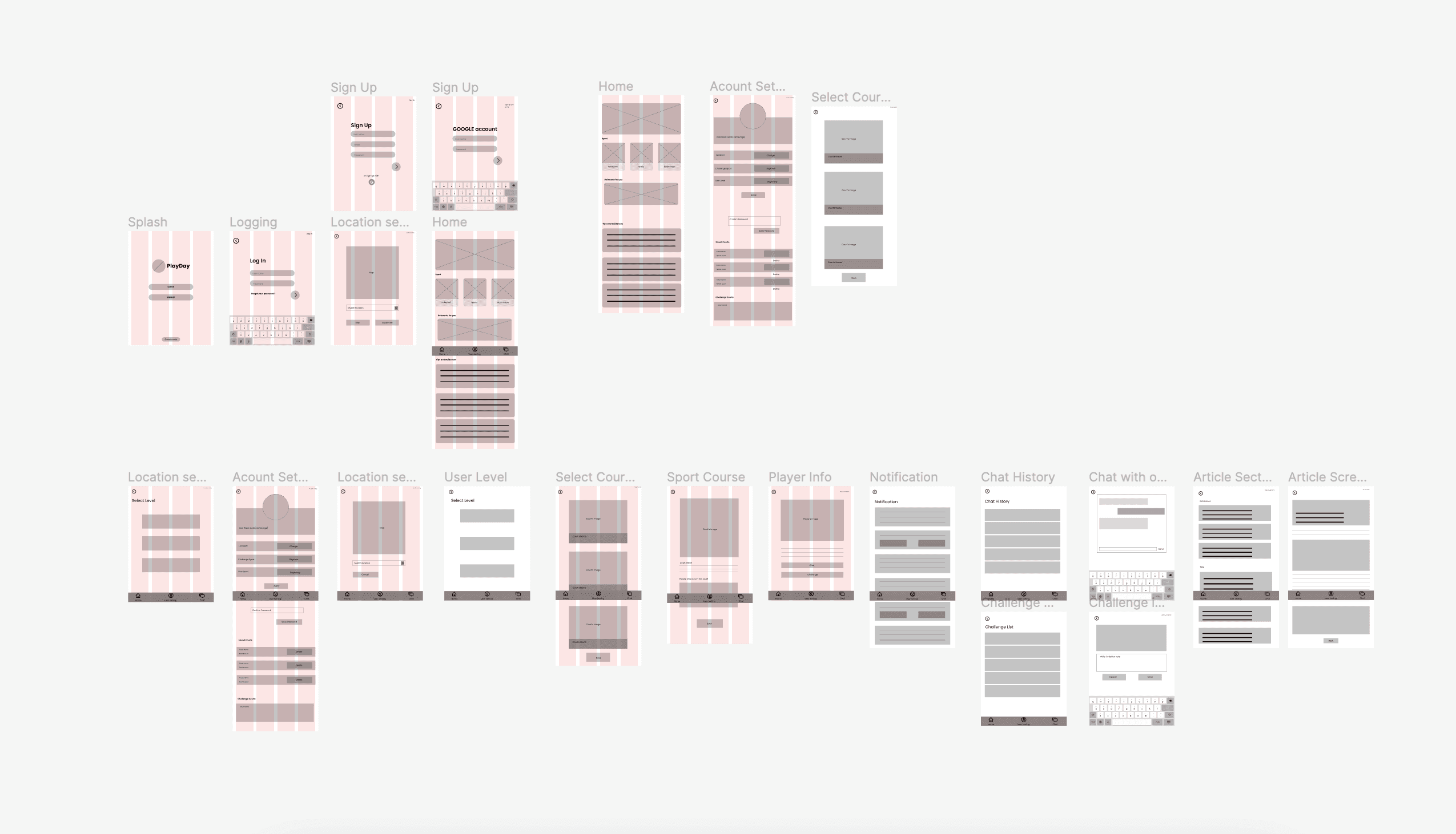
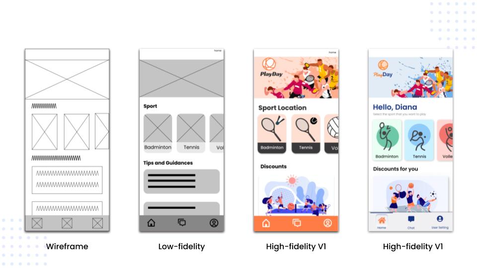
After finalizing the user flow and key features, I transitioned to creating wireframes. Initially, I used simple shapes like boxes and circles, but as the complexity grew, I realized the need for detailed annotations to maintain clarity. Once the wireframes were complete (focusing on themes, collage, and location selection flow), we conducted thorough discussions and reviews with the team.
Diverge
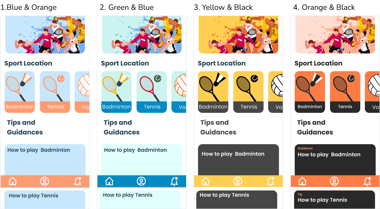
Color Experimentation
As we transitioned into high-fidelity design, our team was uncertain about the color palette to use. Consequently, our team conducted tests with various color palettes to determine which ones were aesthetically pleasing and would align with the purpose of the application .
Accessibility
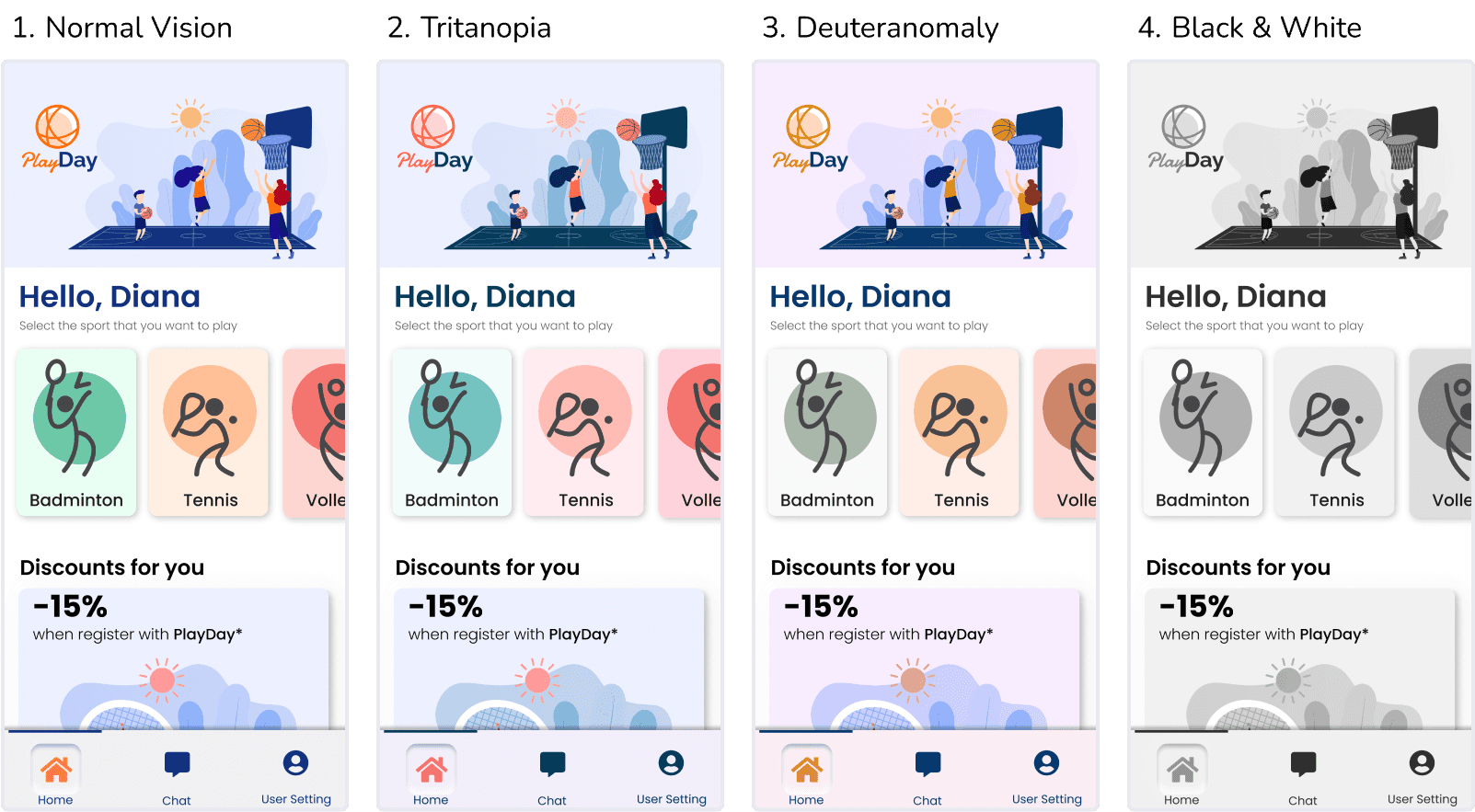
Testing Colors for Accessibility
Based on the survey we conducted, 60% of our potential users are men. As men are more prone to color blindness issues, our design team tested the final colors we selected to ensure our users would be able to distinguish between them.
Develop
Mockups
Here are some of the mockup screens I developed during the design process. We conducted weekly design critique sessions where fellow designers provided valuable feedback. These sessions were instrumental in my learning journey, offering insightful perspectives and fostering a collaborative environment.

BRANDING
App Logo
For the logo, a circle resembling a ball was chosen, as most sports played on the court involve balls. Vivid orange and dark blue colors represent energy and an active lifestyle.

REFLECT
Design Process
Here, you can observe the design process that led to the final product. Our team followed weekly sprints, utilizing them for design reviews and iteration.
RETROSPECTIVE
What Went Well
Overall, the project was successful, and I'm proud of the work accomplished. Specifically:
Weekly sprints proved effective in maintaining motivation and providing clear deadlines.
Communication and critique sessions among designers were highly productive. We fostered a respectful environment and offered honest feedback.
Areas for Improvement & Impact
Despite our successes, there are areas where we can enhance our processes:
Lack of design version control led to challenges in retrieving previous designs and maintaining consistency.
Absence of a designated individual responsible for checking design consistency resulted in some inconsistencies across iterations.